Showing posts with label Web design. Show all posts

Wednesday, January 25, 2023

Discover the Benefits of Using Ubersuggest


Need help with SEO? Most of us do. SEO is probably outside your skill set list if you are a small business owner managing your website. And then, how high a priority in your budget can you allow for SEO costs?

I learned about Ubersuggest early in my pursuit of an affiliate marketing website. I found it to be a welcome partner. In this article, I want to share with you the benefits I have found using the Ubersuggest SEO tools. In short, Ubersuggest is a powerful digital marketing tool that can help you optimize your website, analyze your competitors, and manage campaigns more effectively.

It can help you with valuable keyword research, giving you keyword suggestions and insights. With this data, you will be on your way to meeting your SEO goals. So, keep reading as I delve into many of its features that can help meet those SEO goals.

How I Got Started With Ubersuggest

I have an affiliate marketing website that is about nine months old, and I am still trying to get traction with SEO traffic. As I prepared to launch my site nearly nine months ago, I was looking for tools I could afford to help with keyword research. But the tools I needed were expensive, so I initially settled for free tools. There were better choices than this, though.

Finally, I came across Ubersuggest. I am trying to remember how it came to my attention. As I explored the service, it was not only affordable but offered much more than I would have expected for the price. As I begin this overview, I want to start with the Ubersuggest subscription plans. Then I will go on to highlight some of the features that Ubersuggest.

Subscription Plans

The subscription plan is shown in the image below. As you can see, there are three plans: the individual, the business, and the Enterprise. I chose the Individual Plan for $29 a month. I will get into the plan’s features when I discuss the Dashboard.
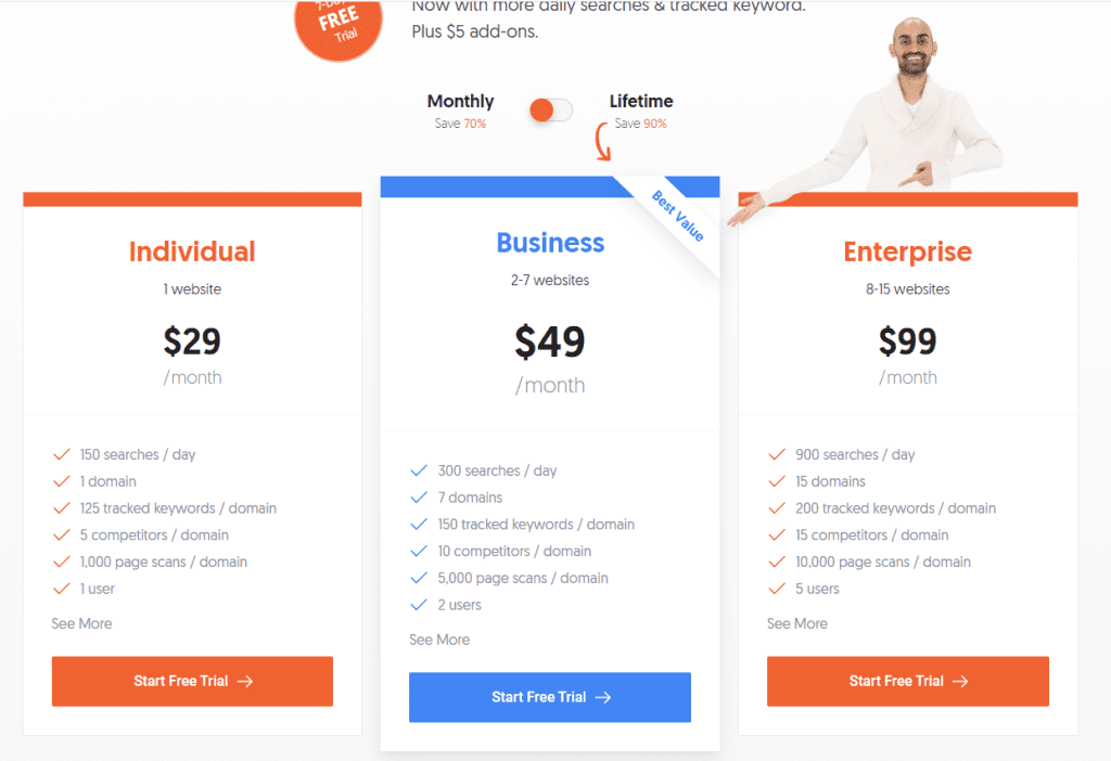
The individual plan allows one domain, whereas the Business Plan allows seven domains, and 15 domains come with the Enterprise. And, of course, the number of searches and other allowances also vary with each plan. About five months after subscribing to Ubersuggest, a lifetime plan was introduced. This plan added even more value to the subscription.

Paying $29 a month amounts to $348 a year. At $290 for a lifetime plan, I’m paying less than I was per year on the monthly plan. And the lifetime is a one-time payment. If you want more features than this offers, you can add them at $5 a month per feature.

Ubersuggest Dashboard

As you would expect, the dashboard provides an overview of information from several different features. So, for instance, it displays SEO issues such as blocked pages and broken links. We also are given items to optimize, such as keywords with more significant potential for specific pages.

Further down, we see the organic traffic. Increasing organic traffic is a big goal. If you are new to this, organic traffic results from Google searches, whereas direct traffic may come from anywhere.

I was excited when my organic traffic began to exceed direct traffic. Now I’m seeing keywords ranking in the top 10 search results. You will see those in the image below.
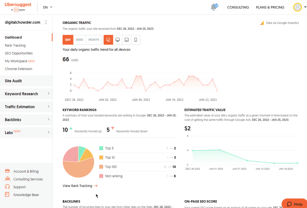
I now have two keywords that are coming in, in the top three now, two that are coming in in the top 10 and then 15, and the top 100 and so forth on-page SEO score gives me my score. And then down here, I can click and go. Well, check out some of my competitors, which I’ll not go into now.

Rank Tracking

Moving on to Rank Tracking, we see more details about keyword search results. For instance, my average search position is shown, and there is more detail on the ranking keywords. Ranking pages are listed along with their search position, volume, and difficulty. This information can be used to capitalize on the content ranking well.

Chrome Extension

The next feature is the Chrome extension. Using this tool, we can learn SEO statistics for any webpage we load in our browser. In the image below, we see the chrome extension displaying information on the neilpatel.com website.
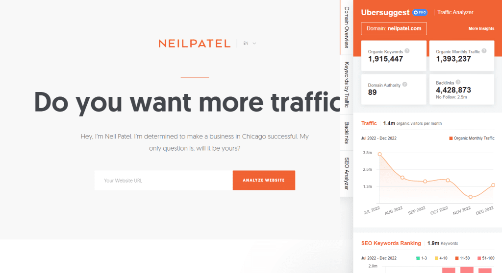
On the Domain Overview tab, We can see the organic keywords, organic month traffic, domain authority, and backlinks. We can also view keyword ranking. Clicking on the Keyword by Traffic tab, we see a list of keywords, their volume, and their position. Using the corresponding tabs, we can view Backlink information and SEO analysis.

The extension is a great tool to use while browsing similar or competitive sites to your own

Site Audit

To continue down through the sidebar menu, the next feature to explore is the Site Audit. Your website will be crawled weekly using this feature and return an audit report. You can initiate an on-demand crawl using the “Recrawl Website” button.
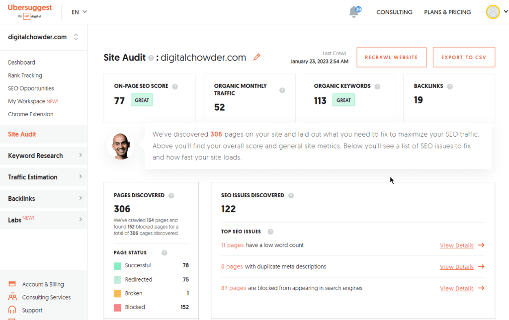
In the image above, you can see that my last crawl was on January 23. My report from this crawl shows an on-page SEO score of 77, an organic monthly traffic of 52, an organic keywords count of 113, and 19 backlinks. As you can see, there is much room for improvement. Based on those numbers alone, I need to work hard at backlinks, keep tweaking on-page SEO scores, and keep up with keyword analysis and strategy.

Next, I could focus on the SEO issues discovered, such as pages with low word count, pages with duplicate meta descriptions, and pages with no H1 headings. From your own experience, you will know that addressing such issues is a never-ending task.

Moving on down the report, I want to check site speed. This, too, can be an ongoing effort to keep the site speed as high as possible. Every new post or major edit threatens to impact the speed.

Three concerns are targeted with site speed:

  • Load Time is “The time it takes for the page’s main content to load.” This report shows a load time of 2.50 seconds which needs improvement but is on the borderline of great. Last week’s report showed great. Keep in mind that the server response during the speed test will have an impact. My next post will address site speed more as I review WPMU DEV WordPress tools.
  • Interactivity is the “total time a page is blocked from responding to user input, such as mouse clicks or screen taps.” This report shows excellent interactivity.
  • Visual Stability – “How much your page layout shifts or jumps while it’s loading.” The report gives a great response. 

Keyword Research

Let’s move on to keyword research. This may be the main area in which you’re interested.

Keyword Overview

Enter a keyword, such as “meal delivery,” for an overview of the results you might expect with that keyword. Here is what we get:

  • A search volume of over 60,500 
  • SEO difficulty of 75 out of a hundred
  • Paid difficulty is 56
  • Cost Per Click (CPC) is $14.18

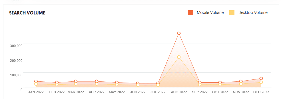
These numbers provide an overview. Let’s go down to “Search Volume” and get the volume trend for the past year. This keyword peaked in August and dropped down the next month. It looks just at the start of an upward trend in December.
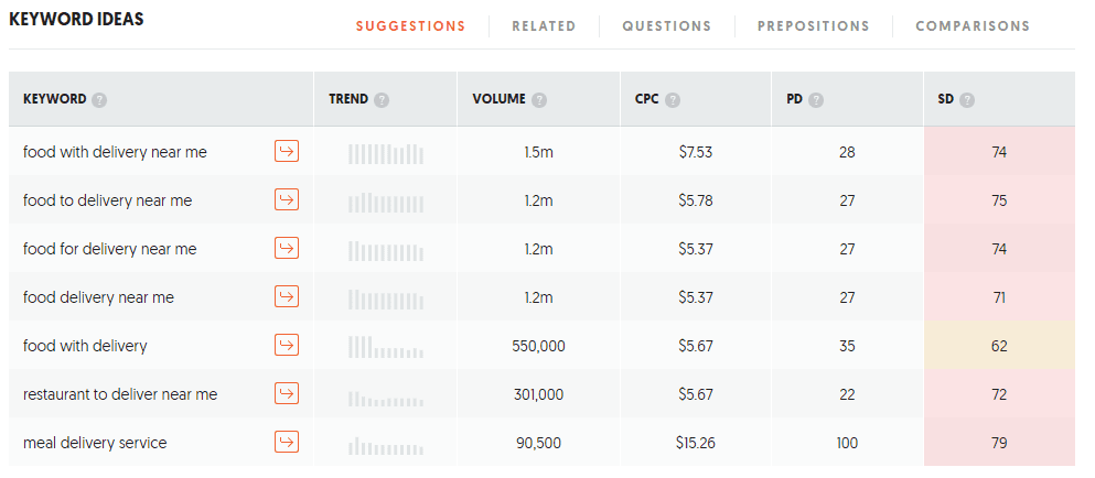
Keep going down the page, and next is “Keyword Ideas.” This list gives a whole list of other forms of the keyword. For instance, based on meal delivery, other ideas include “food for delivery near me” and “food with delivery.” With each picture, you see the trend and volume.

While “meal delivery” has a possible volume of 60,500, “food with delivery near me” has a potential of 1.5 million. You can see how this tool can be beneficial.
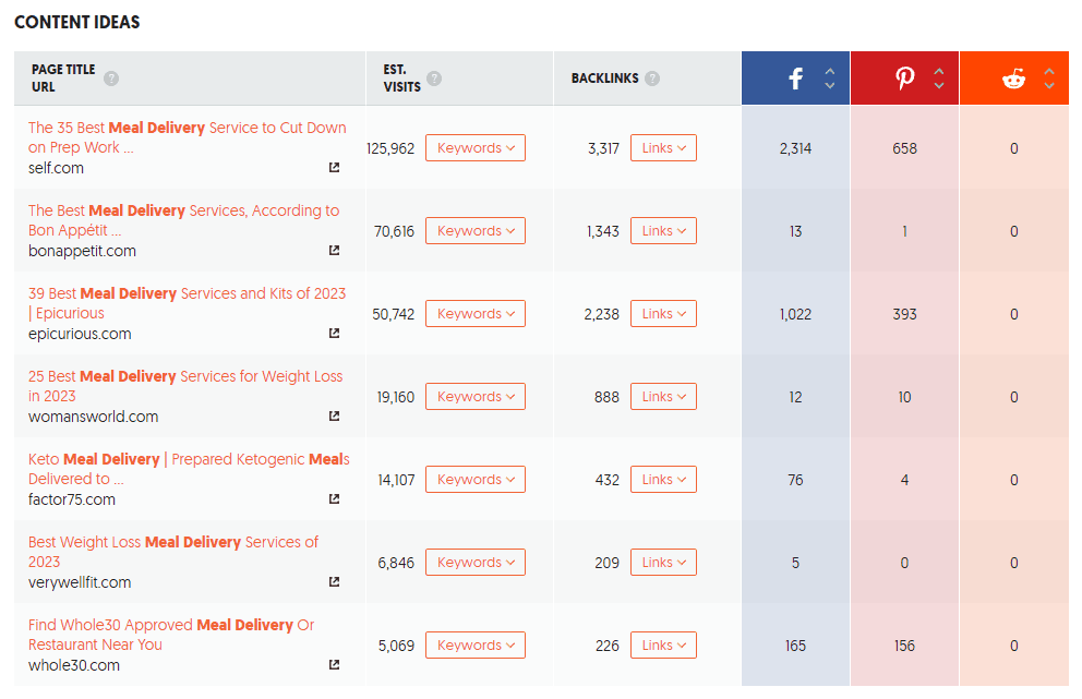
Moving along. The following section is “Content Ideas.” This can be particularly helpful if you blog. Using the initial keyword, “meal delivery,” this section lists content using that keyword along with estimated visits and backlinks. If you decide to go with one of the keyword ideas, enter it in the search at the top of the page and look at the keyword and content ideas.
Keyword Ideas

Next on the left sidebar menu is “Keyword Ideas.” This is similar to the “Keyword Overview” we just discussed. But it takes a slightly different approach.

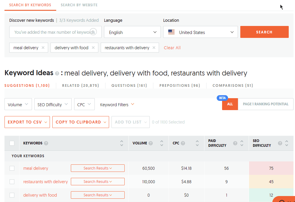
Here you can enter three keywords at one time and search. The result will be a comparison of results for the three keywords. In addition, you get a list of keyword ideas, including their search volume. You can drill down further by clicking on “search results” for a select keyword idea and get a list of URLs using that keyword idea.
Keyword Visualization

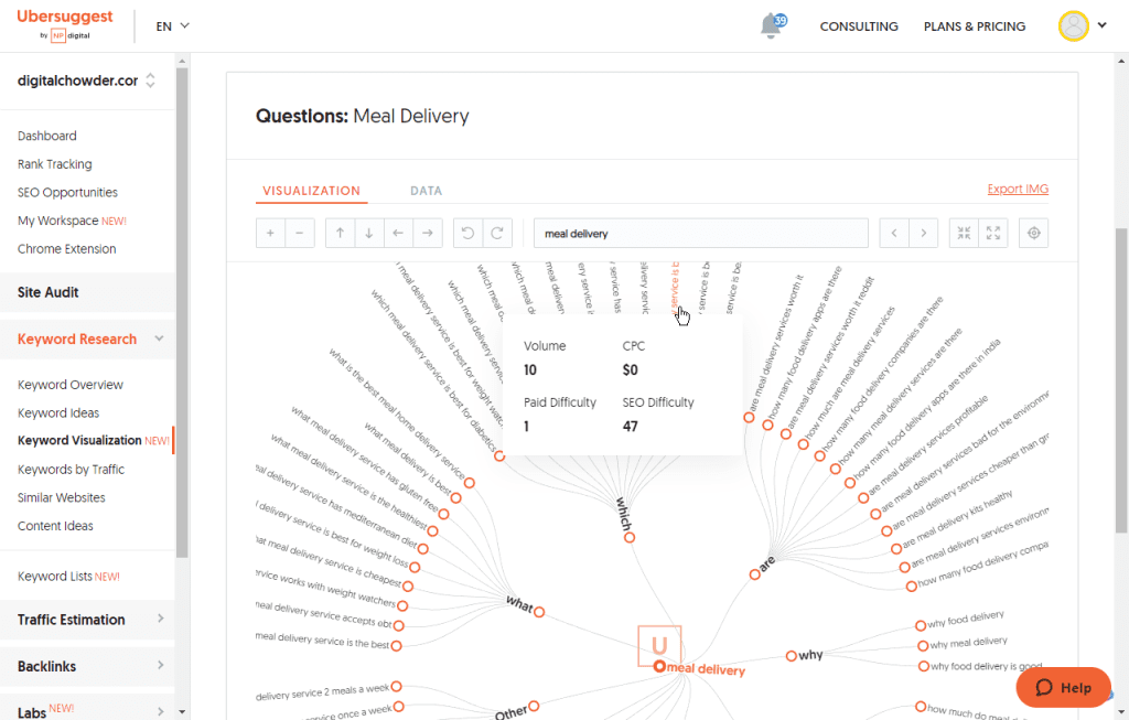
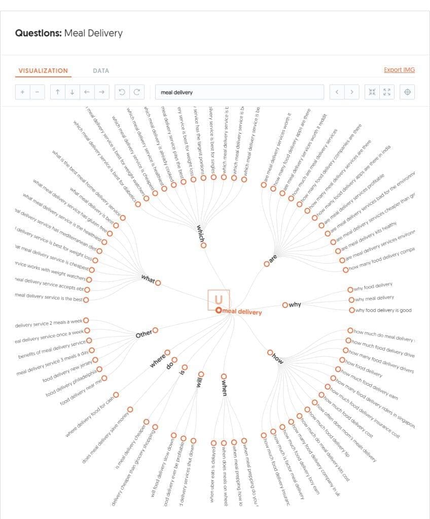
Continuing down the left sidebar menu, we come to “Keyword Visualization.” This is yet another approach to keyword research. Enter your keyword and search. The result will be a large circle showing keyword variations, including words such as what, which, are, why, how, etc. By hovering over each item in the ring, you can see the data for that keyword. Notice the image below.
The visualization image can be exported and is shown here:
Traffic Overview

Skipping a few features in the sidebar menu, I will move on to Traffic Estimation and Traffic Overview.
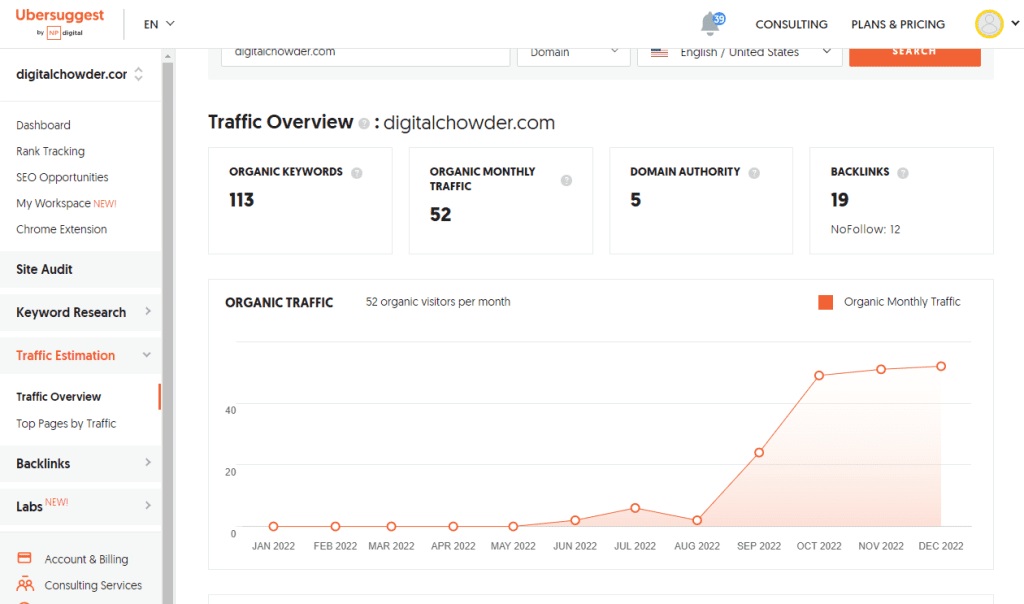
This feature allows you to analyze the keyword results on your website. Enter the URL of your website and search. The first output will be the same statistics you saw on the dashboard. Organic keywords and traffic. Next, you see a graph of your organic monthly traffic for the past year. You will see an image of this graph above.

I launched my website, digitalchowder.com, in April of 2022, so there is no data for the first five months of 2022. June shows two organic visits, July has 6, and August drops back to 2 visits. Beginning in September, the number started to climb dramatically, and since October, is showing slow growth.

As you review your organic traffic in this way, you can identify factors that may have contributed to growth or decline. Unfortunately, with traffic analysis, we are always looking in the rearview mirror. We are still waiting for immediate results for the adjustments we make. It is about three months later that we see the outcome.

AI Writer

Finally, I’m jumping down the sidebar menu to “Labs” and, under that, to “AI Write.” This is one of my favorite features, probably because I blog.

There are several tools of interest with the AI Writer. For instance, you can enter a keyword you want to rank for using the Meta Title tool and get a list of possible meta titles suitable for that keyword. You continue by doing the same with the Meta Description and Headline Generator tools. Other tools include:

  • Paragraph rewriter
  • Answer a “People Also Ask . . ” Question
  • Product Description Generator
  • Listicle Generator
  • Related Hashtag Generator

I often use the feature at the top of the page, which is to “Create New Page.” This feature combines the Meta Title and Description, plus the Headline Generator, all in one process. The result is an outline for a post. You start by entering the keyword for which you want to rank. Then select the title from several you are given, choose a description from several options, and finally, select as many of the headings you want from a list.

Next, turn the writer loose and it will write a document using all those elements, including a paragraph under each heading. If you check the search results in the left sidebar, you will find a list of the web pages from which the data was gathered. With this, you can do further research for your post.

View Video

You can view a video of the article for a more hands-on presentation.


Conclusion

So this has given you a preliminary glimpse of Ubersuggest. You now have a good overview of Ubersuggest features without registering for an account. Here is a link to go over Ubersuggest and sign up for a first-hand trial of the SEO research service.

As mentioned above, in my next article, I will give an overview of WPMU Div. This WordPress site management service offers an array of plugins covering everything from SEO to backup protection to security measures. Plus, it allows one to manage one or many websites at once.

Check back at DigitalChowder.com frequently for information on various topics related to digital resources for Home and Small Businesses. On the Home page, you will find a list of categories for subjects in which you may be interested.

Please leave comments in the section below, including topics you wish I would address in the future.


Simple drag-and-drop website builder software to implement any ideas
Nicepage

WordPress Websites for Small Businesses & Organizations

Elite Web Presence


Thursday, January 5, 2023

My Personal Guide to All the Best Features in Nicepage - Part 3

My Personal Guide to All the Best Features in Nicepage – Part 3


This is my third article in a four-part series about my favorite web builder, Nicepage. In the first article, “My Personal Guide to All the Best Features in Nicepage, Part 1,” we discussed the Nicepage subscription plans. We also mentioned its desktop app for Windows and Mac allows you to design and edit your website offline. Then, in my second article, “My Personal Guide to The Best Features in Nicepage Part 2,” I highlighted special design features in Nicepage that I especially like. Some are even unique to Nicepage.

In this third article, we will discuss the options available on Nicepage, allowing you to publish your site to your website from the desktop app.

Publication Options

I have provided screenshots to help you visualize the comments, but there is also a video further down you can view.

Nicepage Publishing Options

So let’s go to the desktop app for Nicepage. In this case, it is in Windows, but there is also a version for Mac computers. The website showing on the desktop is one I have been working on in the second video for demonstration purposes. We demonstrated some animation, grids, and how they contribute to a responsive website. We also presented a modal, accordion, and tab feature.

Assuming that we are ready to publish our website on the internet, let’s look at our publication options. These methods export the site from our desktop app to our online website. So we go to the publication feature, where you can see the following options:

  • Website. This option uploads the site directly to the Nicepage server. This is a simple way to post the site online and allow clients to view it before launching it publicly.
  • HTML. For those who prefer a simple, straightforward website rather than a CMS such as WordPress or Joomla.
  • WordPress. This is the most popular website option, and Nicepage is a leading theme builder for WordPress.
  • Joomla. Though less popular than WordPress, Joomla offers another CMS option.
  • Image. Publish a one-page image of the site.
  • Website project. This packages the website project for transfer to another computer.

View Video


Website Publication

Website Publish option

Starting with the first option, we will publish to a website. The subdomain to which it will be posted is shown in the window. Use this URL to view the site once it’s published. A custom domain name that you have registered can also be configured to direct viewers to the Nicepage subdomain. A few other options can also be selected in the window, but we will skip them and go straight to “Publish Website.”

Now we can use the subdomain URL to view the site. As you scroll down the home page, you can observe the animation in action with the various page elements as they zoom out or slide in. Click on the button for the modal to have it pop up with the photo slider. And then, you can see how the accordion and tab look and operate. Both are good options for offering viewers an opportunity to view the data or not.

HTML Publication

HTML Publish option

With the option to publish to HTML, we can export the site to a folder, a zip file, or directly to our website using FTP. I use my FTP client, so I take the Folder option and select where to export it.

I will go over to Filezilla, connect to the export folder, and then to my website folder online. I will select all files and folders in the export folder, then drag and drop them into the online folder on my hosting site.

There is no further configuration necessary. I can go to my browser, enter the URL of my website, and immediately view the site. This assumes that my domain is set up with the hosting site and has propagated across the internet.

WordPress Publication

WordPress Publish option

Finally, we will choose the WordPress option for publishing. Again, we can export to a folder, zip file, or FTP. Selecting the zip file option is the most straightforward choice. You will need a more advanced understanding of WordPress to use the folder or FTP approach.

By choosing to export to a zip file, I will install the site on my WordPress website as with any other theme. The only difference will be the import of content and installation of a plugin. The Nicepage plugin will serve as your editor in WordPress to work with your Nicepage web pages.

Before exporting the WordPress zip file, choose which features you want to export to your website. You will want to include the Theme along with pages and Editor Plugin. If you are planning an eCommerce site, retain the templates. If you want to export your site to the desktop app, choose to have the Nicepage Project. Now we are ready to export.

Next, we will go to the wp-admin section of our WordPress website to install the zip file. Once you are in the wp-admin area, select “Appearance” from the left menu and select themes. At the top of the page, click on “add new” and then on “upload theme.” You will locate the exported zip file on your computer and click “install.”

Now that we have installed our website, we need to activate it. Having done that, click on customize, and you will need to go to self-identity. In this section, you will insert your logo and Favicon from your media library or upload them from your computer. Then go further down to insert the site icon.

Now click the back arrow, then go down to the menus. Under menus, you will need to select the menu you will be using. Most likely, it will already be set.

Next, click the back arrow and go to “Homepage settings.” Here you will choose whether the homepage will use the latest post or will be a static page. Although posting is a significant function of my Digital Chowder website, I use a static homepage with links to posts.

At this point, you’re ready to click publish and view your WordPress website online.

In my fourth and final Nicepage-oriented article, I will discuss working with your Nicepage-generated website within WordPress. In addition, I will show how to go back and forth between your online and offline versions of the site. You can view all four articles on YouTube for a better visual demonstration of this presentation.

Website Building and Repair

Elite Web Presence

Do you find all this a bit overwhelming, or do you not have the time to work with a site? Let me make a suggestion. Go over to Elite Web Presence for some help. Whether you need a complete website build and update, or some cleanup and maintenance, they can do the job for you. They can also help with SEO, along with website backup and security.

Conclusion

Has this series been helpful? Building a website with Nicepage is an easy and efficient way to get your site up and running quickly. Using the tools it offers, you can create an attractive design that drives traffic to your pages and gives customers what they need.

Finally, does all of this sound too daunting or time-consuming? In that case, Elite Web Presence can help build, update or maintain your website to optimize it for success.

Have questions or comments? Please leave them in the comment section below.


Facebook Twitter Instagram LinkedIn

Thursday, December 29, 2022

My Personal Guide to The Best Features in Nicepage Part 2

My Personal Guide to The Best Features in Nicepage Part 2


Welcome to the Digital Chowder blog! It is part two of my guide to all of Nice Page’s most impressive features. 

I talked about the Nicepage subscription plans and desktop app in the first video. The app is available for both Windows and Mac. The app allows you to do your design work offline on your computer and do as much as you want online. Just an excellent feature that I have not seen with any other web builder in part two.

In this video, we’ll talk about some of the design features of Nice Page that I like. This article will not be a how-to but will highlight features I like about Nicepage.

Nicepage App Dashboard:

So here we are at the dashboard for the Nice Page app. I use the Windows version. You can see on the left side a list of the websites I am working with on Nicepage. I will select this site I set up as a demo site. So click on it, and we go to the front page of the website design.

Simple Format:

From here, we will talk about the simple Nicepage design format. With some builders, I need clarification on the format and help to know what to do. Also, with some builders, I feel locked into a structure that only sometimes works best for what I want to do. But Nicepage is different.

Websites these days are being built using blocks of content. And that is the case with Nicepage. You can see two blocks in this design in the image above, in addition to the header and footer.

Adding and Designing A Block:

Adding a block is a simple matter of clicking on the add block link and then choosing a design template from the library or adding elements of my choice for a preferred design.

We can see in this first block that an image is in the block as an independent element. Behind it is another separate element called a shape. To the right is a list element comprised of three items called cells.

On the right is a box element. And within the box are a heading, text, and a button. And all of these are in the box. The box ties these elements together. The components within the box move with it, going where it goes. This functionality is essential for a responsive website. We are working within a desktop view, but we also want these elements to remain aligned in a phone view.

Another feature that helps to tie elements together for a responsive website is the grid. We can use 2, 3, or more cells in a grid. These cells can be independent of each other or can duplicate one another. 

And here is what the grid looks like with images in desktop view.

And here is what the grid looks like with images in mobile view.

Modal:

Next, we will look at the modal. I am still looking for the modal in other builders, but it is a feature I like to use. It is one of several ways to offer more information but allows the viewer to choose whether to view it. This feature helps keep a more straightforward and cleaner page rather than cramming in information viewers may want to avoid seeing. By so doing, we can prevent losing visitors who become impatient wading through content they don’t want to get to the content they do want.

Here is what a modal might look like, but view the video below to demonstrate how it functions.

Three choices are available for launching a modal:

  • Button: Launch the modal by clicking a button.
  • Timer: Schedule the modal to pop up a certain number of seconds after the page opens.
  • Exit: Set the modal to pop up when the visitor intends to exit the page.

Modal Plus Slider:

A modal will allow the use of any element. I like to use the slider in modals. I suggest using an image linked to a modal so the viewer can click the image and have a slide show pop-up of other related images.

Animation:

Another neat feature of Nicepage is animation. You will need to view the video to see this in action. Two blocks in the sample web page utilize animation, activated by scrolling. As the block emerges on the screen, the animation is triggered. Scrolling triggers the main image in the block shown below to zoom in. Each cell in the grid also uses zoom animation.

Accordion:

The next feature to highlight is the accordion. If you are unsure what the accordion feature is, you may have seen one without realizing it was an accordion. The modal is often used for FAQs, though that is only one use for them. Shown below is a FAQ accordion.

Reordering Blocks:

Web page blocks serve as units of related content. As such, blocks can serve as visual highlights of their content by using different backgrounds and other graphic design features. An excellent quality of Nicpage is the ease with which you can reorder blocks. Without moving individual elements on the page, you merely need to click an up or down arrow on the block to reorder it above or below the surrounding blocks. Moving a block can amount to significant page editing with the click of an arrow.

Additionally, there may be a block with content that is temporarily unwanted. Will you delete that block you have spent time designing? After all, you will eventually want to include it on the page again. No problem. Hide the block so it does not appear publicly.

Tab:

A similar feature to the accordion is the tab. The tab, like the accordion, allows information to remain hidden until a visitor chooses to view it. So as the example below shows, the tabs identify the data contained under that tab. It is much like a file folder. Clicking the tab reveals its contents.

Menu:

The last feature to highlight is the menu. The unique and convenient factor of the menu feature in Nicepage is that it is unnecessary to leave the page you are working on to edit the menu. No need to go to the WordPress widget and menu section to make menu changes.

Items on the menu can be added, removed, or reordered within the page design. Same with design elements such as hover, active, background, font, etc.

Conclusion:

I hope this article has been helpful. If you haven’t already seen the video or article for part one of this series, I encourage you to read, “My Personal Guide to All the Best Features in Nicepage, Part 1.”

Also, I hope you will use this link for a free download of Nicepage and check it out yourself.

If you have found this article to be helpful, please leave a comment below.


Facebook Twitter Instagram LinkedIn


Friday, December 23, 2022

My Personal Guide to All the Best Features in Nicepage, Part 1

My Personal Guide to All the Best Features in Nicepage, Part 1


Introduction

Hello, and welcome to the Digital Chowder blog. I’m Wayne, and this is the first of four posts and videos I will be doing about All the Best Features of Nicepage, my favorite website builder. This post will not be a how-to about how to use Nicepage. Nor will it be a review comparing Nicepage alongside other web builders. Instead, I will highlight some of my favorite features found in Nicepage.

This first post/video will address the Nicepage subscription plan, why I like it, and why it is a good fit for me. Then I will touch on the desktop app with Nicepage, giving an overview. Finally, I will discuss the options for publishing your website after designing it in the desktop app.

Nicepage Subscription Plans:

If you go to the Nice Page website and then to their premium page, you will see four subscription plans outlined. Each plan has two options: a subscription and a license. So what is the difference? With the license, you’re paying a one-time fee to purchase the software; with that, you’re getting one year of updates for the software. But beyond the first year, there will be an additional fee if you want any updates. I have chosen the subscription approach. With the subscription, you pay an annual fee and receive the software and all updates during the year. And it is ongoing.

When I started with Nice Page, I used the Personal plan since I only needed one website for my business plus a personal site. With the Personal plan, I could have as many as five websites. So that was quite adequate. But now I design websites for other businesses besides my own. So I need to use Nicepage for more than five websites. However, I don’t need an unlimited number of sites.

So, let’s jump over to the Elementor website and look at their plans to understand why the Nicepage subscription is a good fit for me. With Elementor, three plans start with the Essential plan, which is $59 a year. This plan allows you one website. If you jump to the Expert Plan, which is $199 a year, you are allowed 25 websites.

Now let’s go back to the Nicepage website. Back there, the Business plan offers a middle ground between the Personal and Pro plans, which Elementor does not have. The Business plan for $129 a year allows me 50 websites and additional features. This is just right for me. I need more than the Personal plan offers, but I don’t need all that the Pro plan provides. So the Business plan is the one I use. I would pay $199 annually at Elementor and only get 25 sites.

Desktop App:

The next feature I want to highlight is the desktop app with Nicepage. There is a desktop app for both Windows and Mac computers. If you’re building a WordPress website, then you also get a WordPress plugin, or if you’re doing a Joomla site, you get that Joomla plugin.

You can do the whole website on your computer before you import it to your WordPress website. But it is not required. Creating the site layout is the only portion of building a website that requires the desktop app. Once you have created a layout for your website, you can export the site to a zip file and install it as a WordPress theme. You can do the remainder of the design online. Or not! You can also build the complete site on your desktop before installing it online.

Once you have installed the design theme on your WordPress site, you can work back and forth between online and offline.

Once your site is online, you can edit it on the desktop or do it online, whichever you choose. I do both. I like to be able to do major edits on my desktop, knowing that when I do a save, it’s not going to go public.

Next, let’s look more closely at the desktop app.


You can check the video above to see what I’m talking about in the following comments.

As you view the desktop application listed in the left-hand column, you will see a list of your websites. Click the appropriate icon to open the site you want to work with. You can also delete a website you are no longer working with from this page. To create a new website, use the “New Site” button.

If you are creating a new website, you can start with a blank website and build the site from scratch, adding elements as you go. Or, you can use your graphics to form the bases of the site. Yet another option is to select a design template from the various categories listed. Once you choose a template, you can stay close to the template design or use it only as a starting point.

Publishing The Website:

When you are ready to export my website to an online host, I can click the “Publish” button. You can publish a temporary Nicepage-hosted site, an HTML format, or a WordPress theme.

The temporary “Website” option is quick and easy. Press the publish button to install the site on the Nicepage server. Then share the subdomain with a client for their review of the site. There is no configuration or installation or uploads to do to have a site looking like the one on your desktop.

Another option is an HTML site. This choice requires an FTP app to upload to the host server.

If you publish a WordPress site, use the output zip file to install in WordPress as you do with any other theme.

Conclusion

In this post, I have given an overview of Nicepage. In the next post, I will detail some of my favorite design features in Nicepage. Meanwhile, I encourage you to get a free Nicepage download and try it. Then come back to the other posts for further help.

Facebook Twitter Instagram LinkedIn


10 Smart E-Commerce strategies to Increase Your E-Commerce Sales

Increase Your E-Commerce Sales If you need help to increase your e-commerce sales despite putting in much effort, you're not alone. With...